 Choosing paint color for a room in your home? Don't ignore the psychological impact of color. Studies have shown that different hues create different moods; they can even affect behavior!
"There are lots of good reasons to select a particular paint color, including personal preferences and design considerations, but often overlooked is the psychological power certain colors exert on mood, attitude, and outlook," says Debbie Zimmer, paint and color expert at the Paint Quality Institute.
"Even before you go to the paint store or start to look at color cards, think about the mood you'd like in your surroundings," advises Zimmer. "Do you want the space to be relaxing or invigorating? Once you make that decision, the color choice becomes easier," she says.
If your goal is to create a tranquil space, then favor a soft green or pale blue. These are the most calming colors, so they're ideal for rooms where you rest and relax – the family room or bedroom, for example. As a bonus, light blue and green tints are expected to be in vogue this year.
Other "go-to" colors for rooms where you go to rest – again, the bedroom or a sitting room, perhaps – include certain beiges, browns, and taupe. More enveloping than blues and greens, these quiet tints and shades impart more warmth and coziness to a space.
At the other end of the psychological spectrum are paint colors that can inject energy into your surroundings.
Yellow is the best example. Like a splash of brilliant sunshine, yellow walls can lift the spirit and brighten your outlook. What better color to use in a kitchen or breakfast area where you start the day?
Shades of orange – tangerine and apricot, for example – are also energizing, so they too are good choices for rooms where you spend your mornings.
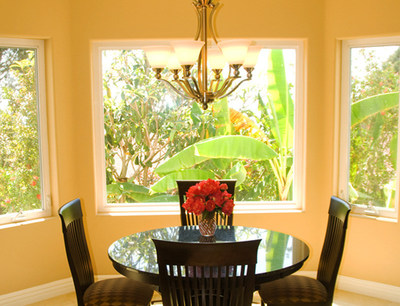
Reds are energizing, too, but they need to be used sparingly, since their bold appearance can literally increase heartbeat. But if you're seeking a great dining room color, look no further: Studies show that red can actually increase appetite, which explains why it is used in so many restaurants.
Aside from the pure color, or hue, of the paint you choose, keep in mind that tone, or brightness, also plays a role in creating mood. Brighter tones invigorate, while those that are muted ("toned down") tend to be more relaxing.
After carefully choosing the perfect interior paint color, make sure it continues to look just so by applying the highest quality paint. According to Zimmer, top quality paints made with 100% acrylic resist fading, so the color you apply is the color you'll continue to enjoy for years to come.
To learn more, visit the Paint Quality Institute's newly designed blog at blog.paintquality.com. It's an attractive, informative, easy-to-use resource for all things related to color and painting.
No comments:
Post a Comment